Photo credit: Philipp Rümmele
Introduction
At lunch today there was a discussion on using responsive images in web projects and some challenges of wanting to display in a nice edge-to-edge manner which leaves the aspect ratio of the image area outside our control.
The question I got that inspired this post was:
Is there any good library or such that'll let me decide the weighting of the featured photo so it'll scale towards the important part?
I actually didn't have a response to this at once, but I was determined to find it since the issue intrigued me.
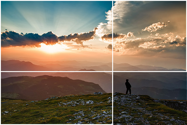
Let's use this photo of a stunning view with a our beloved Eddie (this dude definitely needed a name) looking out over the mountains as an example of a image that'd we'd like to feature.

Basics
We can achieve a responsive, awesomely moody full screen background using the following code:
HTML
<!DOCTYPE html>
<html lang="en">
<head>
  <meta charset="UTF-8">
  <title>Smart cropping</title>
  <link rel="stylesheet" href="style.css">
</head>
<body>
  <div class="coverImage">
  </div>
</body>
</html>
CSS
body {
  margin: 0px; /* Remove the extra margins */
}

.coverImage {
  background: url(coverPhoto.jpg); /* Set our background photo */
  min-width: 100vw; /* 100% of viewport width */
  min-height: 100vh; /* 100% of viewport height */
  background-size: cover; /* cover sizing is what helps us adapt the photo to the div size */
}
See demo here
However, if you play around with the fiddle above, you'll discover that if the area available to display the image strays from the original aspect ratio we are likely to run into two problems. Either the man looking out over the view won't be visible and we'll lose alot of the point of the photo, or even worse, the man and the closest mountaintop both will be outside the field of view and we'll also lose depth in the photo as illustrated below.
In comes Smart cropping
The idea of smart cropping in responsive design is the ability to have a image adapt and follow a main focal point. this is a concern in responsive design where the area we aim to cover with an image can change in both size and aspect ratio.
Awesome, how do we save Eddie?
I had a look around on the Internet for some kind of project that was looking to accomplish this and found that a project named Focal Point was getting alot of attention. Focal Point is a CSS library that provides smart cropping, it is however focused on providing this for legacy browsers and thus it does have alot of bloat if you aren't in need of an option that will work prior to Internet Explorer 9
Another interesting project is Focus Point (No chance for mixing these two up eh?). focus Point solves smart cropping with a js library requiring jQuery, so again there is the issue of some bloat, but if you want some nice fancy transitions and stuff this might interest you. (To his credit he does mention the method I'm suggesting as well and has done some analysis on how his methods weighting differs.)
A clean and minimalist solution.
Being a fan of the simple, I do feel that people tend to over-complicate this issue that can in fact be solved with one line of CSS.
Returning to the sample image, if we look at where we'd like to weight the focus when scaling this image it'd be on Eddie himself. I'd say we'd like to focus in the chest to waist area to make sure we'd get some cliff in the shot as well.
So we get the coordinates from this point and use them to calculate the percentage from the left and top edge.

For width: 437 / 640 = 0.68 which gives us a weighting point 68% from the left edge of the photo.
For height: 289 / 427 = 0.68 again, meaning our weighting point is 68% from the top of the photo.
So, building on our above example, if we add the following line of CSS the image will automatically weight itself towards our target, without adding any bloat to our site.
CSS
background-position: 68% 68%;
See demo (with some tweaking of the weighting) here
Conclusion
So this turned out to be a long post about a simple solution. The point here though, is that it was a valid question and one that illustrates the power of CSS3 and how things that we think may be very complex to achieve. I also am a big fan of the simple solutions when you find them and think they are worth the same attention that a complex one would have gotten. The third takeaway would be to feature the hard work of the two mentioned GitHub projects that have clearly gone way further in depth with this than I have and seem to have solved this decently for legacy software which to me is impressive. Right?